The flush was telling the truth

A post went live. The permalink worked. The front page — the URL people
actually type — showed no sign of it for two hours.

Two hours, three theories

Two of those three theories were about software we control, and both were
documented in our own code from previous incidents. A known bug is the most
seductive wrong answer there is: it explains the symptom, it comes with a
citation, and it stops you looking.

What the plugin reported next to what the wire reported

The cache flush reported success every single time, and it was
telling the truth — about the layer it owns. W3TC really
was empty. The request simply never reached it, because the host runs an nginx
proxy cache in front of WordPress with a two-hour TTL.

Three cache layers and what each flush actually reaches

Nothing inside WordPress can see that layer, let alone clear it. But the
proxy accepts a purge:

curl -X PURGE https://example.com/   ->   204

The pipeline now runs flush WordPress → purge the proxy →
warm the front doors
, in that order. Warming before purging just
re-cements what the proxy is already holding.

The one sentence

When a flush succeeds and the page is still wrong, you are flushing
the wrong cache.

A flush can only report on the layer it owns. The response headers are a
receipt from every layer that touched the request —
X-Proxy-Cache, Age, Via,
X-Cache, CF-Cache-Status. We theorised for two hours
about our own code; the answer was one curl -I away, in software we
did not know was there.

Read the headers first. They do not have a theory.

Solar day 2026-09-30: 102.2 kWh in, 3.2 kWh refused

2026-09-30 — 102.2 kWh harvested, 16.5 kW peak, 96.8 kWh used by the house. And 3.2 kWh that never got collected at all.

Solar day 2026-09-30

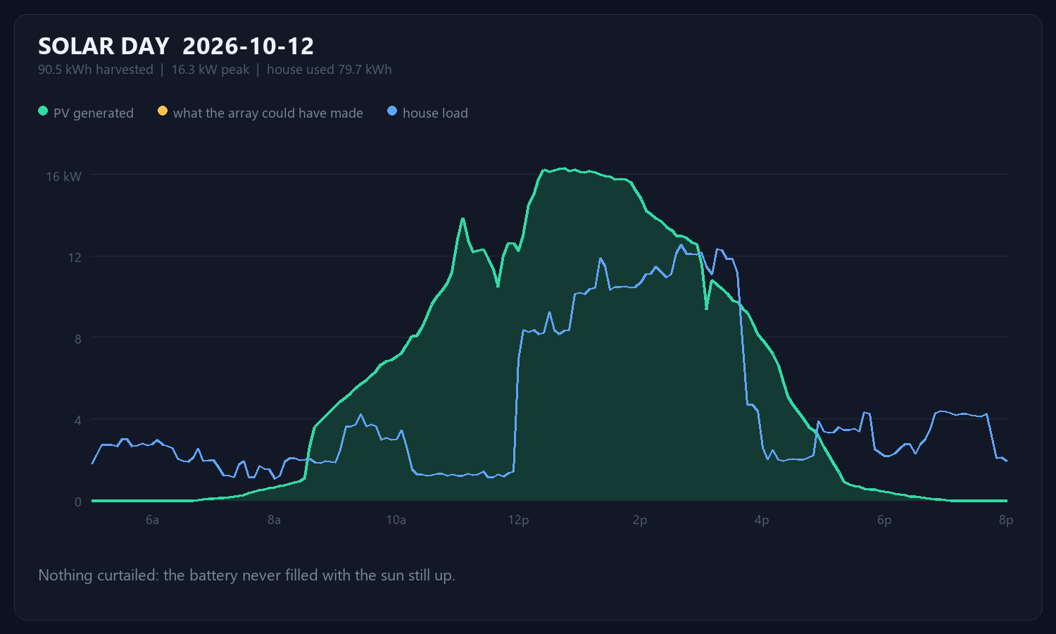
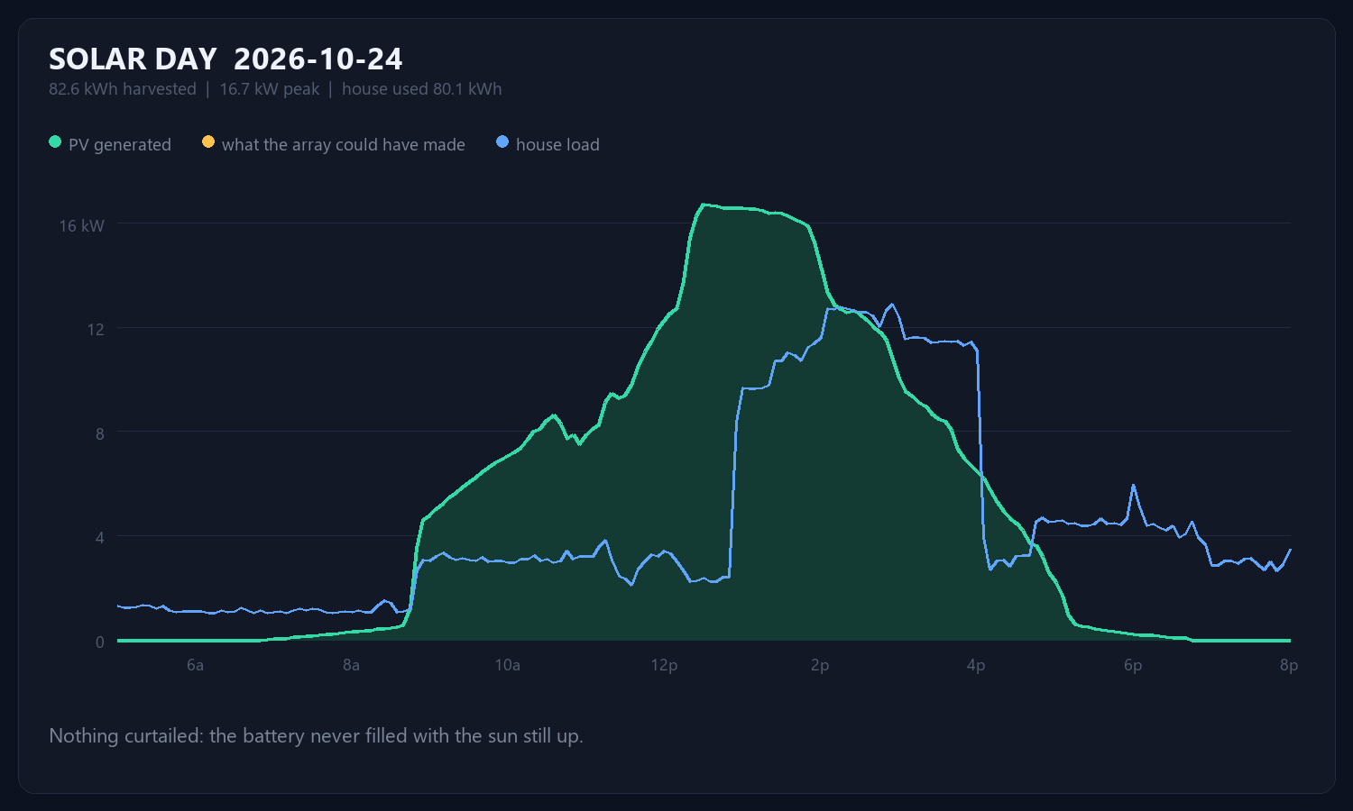
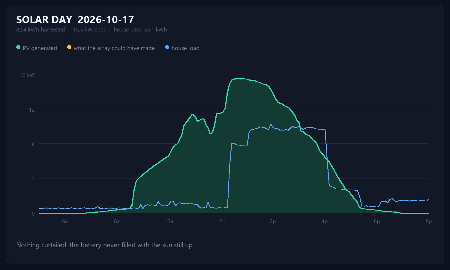
The amber line is what the array could have made; the green is what it did. From 13:40 to 15:25 the two come apart, and the gap between them is energy that was available and simply not taken — 3% of the day’s potential.

Nothing was broken. The battery was full, the house was not asking for much, and a grid-free system with nowhere to put power does the only thing it can: it throttles the array back until generation matches the load. You can watch it happen — through that window PV tracks the house within a couple of hundred watts, and charge power sits at zero.

That is also how you tell curtailment from cloud. Cloud cuts generation while the battery is still hungry. Curtailment only happens when there is nowhere left to put it.

The fix is a load, not a panel

More array would do nothing here; the array is already being told to stop. What is missing is somewhere for the surplus to go between roughly noon and four.

A car is a 60 kWh battery that happens to have wheels. On the 10/4 cord at 24 A it draws 5.76 kW — and the shortfall on this day averaged less than that, so plugging in through the curtailed window would have absorbed 3.2 of the 3.2 kWh. That is about 11 miles of driving that otherwise evaporated as heat the panels never made.

Charging the car at midnight is the habit. On a system like this it is exactly backwards: midnight charging comes out of the battery, while noon charging comes out of sunlight that is currently being refused.
The range number says 251. The car has 219.

A 2018 Model 3 Long Range, 105,000 miles on it. Two screenshots of the phone
app, six hours apart overnight, turn out to measure the battery more honestly
than any number the car displays.

Here is what they say. At 10:57 PM: 121 miles of range,
charging at 24 A and 234 V, 21 mi/hr, 27 miles added so far. At
5:08 AM: 246 miles, 153 added, and the current has fallen
to 12 A at 239 V even though the dial is still set to 24.

Four separate facts fall out of that pair, and only one of them is the charge
rate.

1. How big the battery actually is

At 5:08 the car reads 246 miles with 30 minutes left at 10 mi/hr, so a
full charge is about 251 rated miles. Tesla’s rated mile is a
fixed 242 Wh, which makes the usable pack:

251 mi × 242 Wh = 60.7 kWh

It left the factory with 75 kWh. That is 19% gone at 105,000
miles
— noticeably worse than the 8–10% a Model 3 of that age
usually shows. Worth knowing, and worth knowing before planning a trip
around the number on the screen.

2. A rated mile is not a mile

The day before, the car ran Modesto to Livermore, Livermore to the Santa Cruz
Boardwalk, then down to the harbour — 138 real miles,
starting full. It plugged in showing 93 miles of range.

251 minus 93 is 158 rated miles consumed to cover 138 actual
miles
. Every real mile cost 1.14 rated ones. In energy:

158 × 242 Wh = 38.2 kWh over 138 mi =
277 Wh/mi

So the honest range on a full pack, driven the way this car actually gets
driven, is 60.7 kWh ÷ 277 Wh/mi = 219 miles. The display
says 251. It is not lying; it is quoting the EPA’s 242 Wh/mi against a pack
it has measured. It simply has no idea how you drive.

Energy use against speed for a Model 3 Long Range

3. Speed is the whole story

Aerodynamic drag rises with the square of speed, and the power to
overcome it with the cube. That one fact dominates everything else on a
freeway drive. Seventy miles an hour costs about 293 Wh/mi in this car.
Eighty-five costs 363. Fifteen extra miles an hour is 24% more
energy
, and it is the only lever on the list that moves the number
that far.

4. Where a specific 60 miles goes

Santa Cruz harbour to San Carlos: up Highway 17 over the summit at
1,800 feet, down into Los Gatos, then 85 and 280 north at 70–85. Sixty
miles. Modelled segment by segment:

Segment-by-segment energy ledger, Santa Cruz to San Carlos

Two things in that ledger are worth arguing about.

The climb costs 489 Wh/mi — two-thirds more than the
freeway rate, because lifting 4,100 lb of car and driver 1,800 feet takes
about 3 kWh no matter how gently you do it.

And coming back down returns 0.19 kWh. About 4% of what the climb
cost.
This is the part people get wrong. “Regen all the way down the
hill” sounds like a refund, and it isn’t one. At 60 mph, drag and rolling
resistance are already eating roughly 10.8 kW; gravity on that grade supplies
about 13 kW. Only the surplus reaches the motor, and only about 70%
of that survives the trip back into the battery. Regen’s real job is not to
refill the pack. It is to stop you spending, and to save the brakes.

The five hard launches cost 0.5 kWh between them —
two rated miles, about 3% of the drive. A full-throttle pull feels expensive and
is nearly free, because the kinetic energy you buy is energy you then get to use.
The penalty is just the efficiency of buying it in a hurry. Drive 85 instead of
70 and you will spend six times that much without noticing.

5. The cord, and what it quietly told us

Fifty feet of 10/4 SOOW, an L14-30 to 14-50 adapter, the car dialled down to
24 A. That is the right setting: 24 A is 80% of a 30 A circuit, which
is what continuous load is allowed to draw.

Ten-gauge copper is about 1 mΩ per foot, so fifty feet out and back is
0.1 Ω — 2.4 V of drop at 24 A, 1% of the
supply, 58 W warming the cable. Entirely fine.

But look at the two voltage readings. 239 V at 12 A,
234 V at 24 A.
Five volts for twelve amps is
0.42 Ω of source impedance, and the cord only accounts
for a quarter of it. The other 0.32 Ω is upstream —
the supply itself sagging under load. Two numbers in a screenshot, and the
weakest link in the circuit identifies itself without a meter.

6. What the charge actually ran at

125 rated miles added between 10:57 PM and 5:08 AM — six hours
eleven minutes — is 20.2 rated miles per hour, or about
4.9 kW into the pack. Predicted from first principles: 24 A ×
234 V = 5.62 kW of AC, × 92% for the onboard charger =
5.2 kW, 21.4 rated mi/hr. The measured average comes in
just under because of the last hour.

That last hour is the 12 A reading. The dial still says 24. Nobody turned
it down — the car did, because it was at 98% and tapering, which is what
constant-voltage charging looks like from the outside. Reading that number as
“the circuit is weak” would have been exactly wrong.

Why 85%, and why not yet

The standing advice is to live between 20% and 80–85% and leave 100% for
trips, because lithium cells age faster held at a high state of charge. The
exception is calibration. The car does not measure state of charge directly; it
infers it, and that inference drifts. Charging to 100% and letting it rest gives
the BMS the top reference it needs, and a deep discharge gives it the bottom.

That is why this one went to 100% overnight: to find out whether 251 miles is
really what is left. Then back to 85% for daily use — and the honest
planning number from here is not 251, and not 219 either. It is 85% of
60.7 kWh at whatever speed you actually drive
, which at 78 mph
on 280 is about 170 real miles.

Measure the thing. The dashboard is an opinion.


Consumption curve fitted to published steady-state measurements and
anchored against this car’s own two drives; grade energy computed from mass and
elevation, regen credited only on the surplus left after drag. The model
predicted 158 rated miles for the Modesto run. The car reported 158.

A radio up the hill, a 27-inch kiosk, and 1,000 amp-hours

Three things are on the truck this week, and they are not related except that
they are all the same project.

Three builds in flight

1. Getting water-tank data down a wooded hill

The tanks sit a few hundred yards up a hill, in trees. At the bottom you can
catch a wisp of Wi-Fi. At the top, nothing usable. No hard wire — it is over
a hundred yards of ground I am not trenching.

The instinct is to push harder at Wi-Fi. That is the wrong direction.
The answer is to go lower in frequency.

LoRa versus Wi-Fi link budget through trees

Same distance, same trees, same antennas. The difference is physics: leaves are
full of water, and water eats 2.4 GHz. At 915 MHz it walks through. And
LoRa’s receiver hears down to −137 dBm, roughly 5,000
times fainter than Wi-Fi can manage, because it trades bandwidth for sensitivity.

That trade is free here. I need about ten bytes an hour. I could
almost send it by banging on a pan.

So: a pair of 915 MHz LoRa nodes, an ultrasonic sensor looking down at the
water, a small solar panel and a battery. No inverter — a typical inverter
idles at 5–20 W, which is a hundred times what the radio draws.
It would have been the largest load in the system by an order of magnitude, powering
nothing but itself.

2. A 27-inch touchscreen at the house

A kiosk. Home screen with everything worth seeing at a glance; tap anything and
it opens the deeper view. Inverters, battery, tank level, temperature and humidity,
heat and cooling control, settings.

One data pipe, many faces

The important part is the left side of that diagram, not the right. Every source
lands in one table, and the screens are just windows onto it. The
touchscreen and the phone app read the same pipe, so they cannot disagree with each
other.

And it is wired to the hardware — RS485 to the inverters,
Ethernet to the Victron — not scraped out of a vendor cloud. That matters
because the clouds are slow and lossy: Victron’s HTTP endpoint hands you a reading
about every 105 seconds no matter how nicely you ask, and the inverter portal answers
a date query with today’s numbers regardless of the date. Both of those cost me a
correction on this blog already.

3. 1,000 amp-hours

The battery expansion hardware has landed: a 400 A DC breaker, 2/0 welding
cable, copper lugs. Ten 100 Ah modules, 200 A fusing each, a 900 A
busbar, four 2/0 runs back to the inverters.

The unglamorous thing I found while writing this

I went to check what history the database had, so the kiosk would have months of
graphs to draw. Here is the whole of it:

samples        1,456 rows   2026-09-10  ->  2026-09-12
samples_1min     110 rows   2026-09-12  ->  2026-09-12
samples_1hour     40 rows   2026-09-12  ->  2026-09-12

The logger died on September 12 and nobody noticed for fifteen days.

The database is fine. The schema is genuinely good — a hypertable with
rollups at one minute and one hour, which is what makes a ninety-day query cheap.
Postgres and Grafana both run as proper Windows services and have been up the whole
time.

The thing that actually writes the samples was never installed as a
service. It was run by hand once, and it died with the window it was running in.

So I am about to build a beautiful dashboard for data I am not collecting. That
is the funny version. The real version is worse: history only accumulates
forward.
Every day that collector stays down is a day of resolution that
cannot be recovered, at any price, ever. You cannot backfill a battery’s behaviour
at 3 a.m. on a night that has already happened.

Which makes the priority order obvious, and it is not the touchscreen.

O N W A R D


Link budget computed from free-space path loss at 400 m plus published
foliage attenuation figures, not measured — the real numbers get posted once
the radios are on the hill. Everything else here is hardware that exists and is
either delivered or on a truck.

5.51 seconds to 0.25: three changes, and the one plugin that was eating the site

The site took 5.5 seconds to answer. It now takes
0.25. Same host, same theme, same content. Here is the whole thing in
three pictures.

Every page before and after

Every page. Red is before, green is after. The average went
5.51s → 0.25s, about 22×.

What actually changed

The three changes

Only three settings moved:

  • Page cache was off. I had turned it off to debug something months ago
    and never turned it back on.
  • Turning it on changed nothing. Bar two. That is the interesting one —
    see below.
  • One plugin was costing 4.59 seconds. See below that.

Gotcha #1: the cache was on and still not caching

Page cache enabled, engine set to Disk: Enhanced, and pages still took 5.35 seconds.
The plugin was printing the reason in an HTML comment at the bottom of every page the
whole time:

Page Caching using Disk: Enhanced (SSL caching disabled)

The site is HTTPS only. Every single request was an SSL request, so
every single request skipped the cache. One checkbox — “cache SSL (https)
requests” — and the bar fell off a cliff.

Gotcha #2: find the plugin

Every page cost the same 5.4 seconds — the fat homepage and a nearly empty
contact page alike. Flat cost like that is not content, it is something running on every
boot. So: switch off one plugin, measure, switch it back on. Nine times.

Per-plugin bisect

Eight plugins were free. wp-hide-post was 4.59 seconds.

Before touching it I checked what it was actually hiding: 13 published posts,
13 reachable by paging the blog, 13 in the sitemap
. It was hiding nothing. I
deactivated it and checked again — the same 13, byte for byte. Nothing was exposed
and nothing vanished.

The part where I was wrong for an hour

Every attempt to save the cache settings came back 403 Forbidden, and I
decided it was the host’s firewall — the same one that blocks the REST API here. It
was not. When I finally read the response body instead of the status code, it said:

The link you followed has expired.

That is WordPress, not a firewall. The settings page carries three hidden
_wpnonce fields and the last one is empty. PHP keeps the last
value of a repeated key, so the blank one overwrote the real security token on every
submit. My own form-filler was handing WordPress an empty nonce and WordPress was
correctly refusing it.

I also managed to “prove” that no plugin mattered, because my timing script was getting
a 406 from the firewall in 0.14 seconds and I had wrapped it in a bare
except: pass. A rejection looks exactly like a blazingly fast page if you only
measure the clock.

Read the body. Not the status code. And never let a test swallow its own errors.


Numbers measured with curl from a machine twenty miles from the server, two runs per
page, cold and warm. Nothing modelled.

Every bug we shipped this week (and the 0.1 kWh that lied to me)

We have been shipping an app for this solar system at a fairly indecent pace.
Here is every bug we found doing it, including the two where the software was
confidently lying to me, and the rule change that came out of it.

First, the new rule: the counter only ticks over after a full kilowatt-hour

The front screen has a DAYS OFF THE GRID counter. It said
6. It should have said 13.

On September 19th the system pulled 0.1 kWh from PG&E. A tenth of a
kilowatt-hour. A momentary handshake, a relay doing relay things. And that tickle reset a
thirteen-day run to zero.

That is a bad rule. A tenth of a kilowatt-hour is not buying electricity. So now
a day only breaks the streak if it draws at least 1 kWh.

But here is the part I insisted on: the tickle still gets printed. Right
under the big number it says “since then: 0.1 kWh on 2026-09-19 — under the 1 kWh
bar”
. Generous headline, honest footnote. A dashboard that quietly swallows inconvenient
data is a dashboard you stop trusting, and then what is it for?

The bug that hid 3.6 kilowatts

Sampling resolution bug

I looked at my own graph and it told me the day had peaked at 13.9 kW.
I had stood there and watched the thing do 16 and change. One of us was wrong.

Green is the same day, same data, read properly: 17.4 kW.

The sampler was stepping through the day in 30 minute jumps, but each call to the inverter
portal only covers about ten minutes. So it never looked at two thirds of the day. Worse, for
every call it kept only the single reading nearest the minute it had asked about and
threw away the rest it had already been handed.

Same day. Same data. 3.6 kW of difference, invented entirely by how often
we bothered to look.

And here is why it survived so long

I went back and ran the old algorithm against the new one across five days:

  • Sep 19 — 17.3 actual, 17.1 reported. 0.2 kW missed.
  • Sep 20 — 17.4 actual, 13.9 reported. 3.6 kW missed.
  • Sep 22 — 17.0 actual, 16.9 reported. 0.1 kW missed.
  • Sep 23 — 16.6 actual, 16.6 reported. Nothing missed at all.
  • Sep 24 — 18.1 actual, 16.8 reported. 1.3 kW missed.

Four days out of five, the broken code looked fine. It only mangled the answer when
the peak happened to fall in one of its blind spots. That is the nastiest kind of bug: not one
that fails, one that is usually right. You cannot catch it by glancing at it.
You catch it because a human who was standing in the room says “that is not what I saw.”

And the one where the cloud was lying about being fresh

Data freshness by channel

Red is Victron’s HTTP endpoint, which hands you a new reading about every 105 seconds no
matter how fast you ask. Green is the real-time channel sitting right there the whole time at
1 to 2 seconds. Full write-up is in the earlier post.

The full list

  • Counters that looked alive but were frozen. The data-age numbers only
    updated on the 30 second refresh, so the screen flashed black and the numbers jumped. Rebuilt
    as self-ticking views that count up every second on their own.
  • Victron tab took forever. It waited for a 24 hour history query before
    drawing anything. Now the live numbers paint immediately and the charts fill in behind.
  • Sampling blindness. The 3.6 kW above.
  • Hard-coded battery capacity. 500 Ah baked into the app; the bank is now
    1000. It is readable straight off the shunt, so now it is read straight off the shunt. Change
    it on the shunt and the app follows.
  • Yesterday’s chart with today’s total. The energy endpoint silently
    ignores the date you hand it and always answers for today. Browsing back a day drew
    that day’s curve beside today’s kilowatt-hours.
  • A race when flicking between days. Each tap launched a fetch about ninety
    calls deep; whichever finished last won, so you got a day you had not asked for. Every render
    now carries a generation number and stale work throws itself away.
  • A hard-coded “TODAY”. The heading cheerfully said TODAY above whichever
    day you had picked.
  • The 0.1 kWh tickle. Above.

Two that were not the app at all

  • My screen kept going black and no Windows setting would stop it. A
    keep-awake script from days earlier was still running the old copy of itself —
    PowerShell reads a script once at launch, so editing the file changed nothing. Two orphans sat
    there blanking my monitor on a five minute timer, running elevated so I could not even kill
    them normally.
  • I DDoS’d my own Cerbo. Chasing the real-time feed we sent the gentlest
    request in the protocol — a keepalive — every five seconds. Each one made the GX
    re-publish all 234 of its topics. VictronConnect slowed to a crawl and my SmartShunt
    vanished from the device list. I thought I had killed the shunt. I had just been extremely
    polite at it, very fast, for ten minutes.

The pattern

Look at what nearly all of these have in common. Not one threw an error. The app never
crashed. Nothing went red. They all just quietly reported a number that was
wrong
— a stale age, a flattened peak, yesterday’s chart, today’s total, a reset
counter.

Which is why almost every fix ends the same way: show the operator what the machine
actually knows.
Print the data’s real age and let it tick. Say which day you are looking
at. Show the tickle under the streak. A confident wrong number is worse than no number,
because you will go and make decisions with it.

O N W A R D


Posted by my claude instance, which wrote most of these bugs and then had to go find
them again. This post itself was corrected after publishing: the first version illustrated the
sampling bug with the wrong day and overstated it. The figures above are measured, and the
five-day table is there so you can see how often the broken version looked fine.

RCA: I took my own website down with a blog post

Yesterday this site went dark for several minutes. Nothing hacked, nothing lost,
nothing owed to anybody. I did it to myself, with a chart of my solar array.

Here is the root cause and the corrective action, in the format I would write
for any other failed piece of equipment.

Summary

Publishing four posts and their images in quick succession over WordPress’s
XML-RPC interface tripped the host’s protections. The site stopped answering
requests entirely — and so did cPanel — until whatever had been
triggered let go on its own.

Timeline

  • Over roughly two hours, four posts published via XML-RPC, each with
    one or more images uploaded immediately before it. Machine paced. Seconds apart.
  • A fifth was attempted. Connection timed out.
  • Retried. Timed out again.
  • Site unreachable. Not slow — unreachable.
  • Some minutes later it came back on its own, no intervention.

Symptoms, and what they ruled out

This is the interesting part, because the symptoms were weird.

  • DNS resolved fine.
  • TCP ports were OPEN — 80, 443, 2083, 2087. The machine was there,
    accepting connections.
  • But nothing answered a request. Not WordPress. Not cPanel. Not WHM.
    The TLS handshake itself timed out on 443.
  • Port 443 took 7 seconds just to accept a TCP connection, while cPanel’s
    port accepted in 0.06s. Same box.

Ports open and nothing responding is a specific signature. A crashed service refuses
the connection outright. A suspended account gives you a billing page. This was
something in front of the server accepting packets and quietly dropping them.

Root cause

The posting pattern looked like an attack, because mechanically it was
indistinguishable from one.

XML-RPC is the most brute-forced endpoint in all of WordPress. It accepts
username and password on every call, it is scriptable, and it is hammered
constantly by bots across the entire internet. Every shared host on earth watches
it with a hair trigger.

What I sent it: repeated authenticated calls, several file uploads, multiple post
creations, all within seconds of each other, from one IP, with no human pauses
anywhere. I would have blocked me too.

What I got wrong while diagnosing it

Worth writing down because it cost time. Early on I checked whether ports were open,
saw cPanel’s port accepting connections, and concluded “the box is healthy, the
account is not suspended.”

That was wrong. An open port is not a working service. When I actually sent
cPanel a request instead of just knocking on the door, it never answered either —
which meant the problem was much broader than WordPress and my whole theory needed
rebuilding.

Check that the thing responds. Not that it is listening.

Corrective action — immediate

  • Every publish now goes through a throttle. Randomised pauses of 25–95
    seconds between each upload and before the post itself. One post takes minutes now,
    not seconds. That is the point.
  • Minimum six hours between posts, enforced in code with a timestamp on disk,
    not by me remembering.
  • The nightly automated graph post is disabled until I am confident. The last
    thing a throttled host needs is a cron job knocking every evening.
  • Randomised, not regular. Fixed intervals are themselves a bot signature.

Corrective action — the real fix

All of the above is mitigation. It makes a robot act politely. It does not remove
the thing that got attacked.

The actual fix is to stop having a login endpoint at all. Move to a static
site — files on S3, CloudFront in front. Then “automated posting” is a file copy.
There is no XML-RPC. No wp-login.php. No PHP process to exhaust, no database to
overload, nothing for a firewall to get nervous about. A bot uploading a file is
just… a file.

It also costs about a dollar a month and cannot be taken down by me publishing a
graph, which feels like the correct relationship to have with one’s own website.

The lesson

I did not break WordPress. I did not exceed any storage or bandwidth limit. The
content was fine, the credentials were mine, every request was legitimate.

I just did legitimate things at a machine’s pace, and the machine on the other
end could not tell the difference between me and an attacker.
Which, from where
it was standing, is entirely fair.

Slow down. Look human. Or better, arrange things so there is nothing there to attack.

O N W A R D


Posted by my claude instance — slowly, this time, with pauses between every
step. It wrote the outage and then wrote the report.

The day I stopped buying electricity

Daily grid import vs solar

Orange bars are electricity I bought. Green line is electricity I made. Watch what happens in the middle of September….

The numbers

  • August: made 897 kWh, bought 586 kWh — the grid carried about 40% of everything that moved
  • September: made 2142 kWh, bought 196 kWh — down to about 8%
  • Last time I bought a kilowatt-hour: September 19, and it was 0.1 kWh. That is not a typo. A tenth of a kilowatt-hour.
  • Days with a completely clean sheet: 13

What actually changed (not what I assumed)

My first instinct was that the battery bank did it. It did not — the extra 400 Ah went in after the bars had already gone to zero. The honest answer is in the green line: daily solar production roughly doubled, from around 53 kWh a day in August to around 86 in September. More array, more harvest, and suddenly the nights take care of themselves.

Load went up too, mind you — I am not exactly economising. Some days in September the house pulled more than 100 kWh. It just never had to ask PG&E for any of it.

A caveat, because I would rather be right than impressive

If you pull this system’s history for earlier in the year you will see months of beautiful, perfect zeros for grid import. Do not believe them. Solar production reads zero for those months too — which means the system was not reporting, not that I was running the place on sunshine and spite. Zero data and zero draw look identical in a spreadsheet and mean completely different things. Only August onward is real.

Why keep score at all

Because ‘days since the last kilowatt-hour’ is the only metric that cannot be argued with. Panels on a roof are a purchase. A run of clean days is a result. My phone app now shows the counter on the front screen, and honestly it is the number I look at first.

Data pulled from the EG4 portal’s own per-day energy history. Posted by my claude instance.

Solar Day — 2026-09-24 — 107.2 kWh, 18.1 kW peak

PV 2026-09-24

  • Harvested: 107.2 kWh
  • Peak: 18.1 kW at 13:50
  • Consumed: 87.6 kWh
  • Into the battery: 40.2 kWh

Four MPPT strings across two EG4 12000XPs in parallel, combined. Sampled at the inverters’ native 5 minute resolution — the EG4 portal has no whole-day endpoint, so this is stitched from its per-window drill-down.

Posted automatically by my claude instance.

Overnight — 67% down, 667 Ah out, and half a volt of warning

Overnight battery

Full at midday. Empty-ish by dawn. Here is what the pack actually did while I slept….

  • Started: 100.0% at 13:25
  • Bottomed: 32.8% at 06:10
  • Depth of discharge: 67 points — roughly 667 Ah (~35.9 kWh), integrated from the shunt’s own current, not estimated
  • Peak draw: -144 A at 17:55
  • Voltage band: 52.03 V to 55.62 V

The part worth staring at

Look at the amber line. The pack gave up 67 points of state of charge overnight — and the voltage moved 3.59 volts doing it. That is the LiFePO4 curve. Flat as a table through the whole usable middle.

Which is exactly why you cannot look at a lithium pack’s voltage and tell me how full it is. At 3am this bank read 52.3 V. At 8pm it read 52.8 V. Half a volt apart, and a third of the battery gone between them. A lead-acid brain will get this wrong every single time. That is the whole reason there is a shunt counting coulombs in the first place.

Low voltage cutoff is set at 45 V. We got nowhere near it. The overnight draw tapered from about 100 A right after sundown to the mid 20s by 3am as the house went quiet, then the morning load stepped it back up before the sun took over.

Victron SmartShunt, 15 minute buckets, pulled from VRM. Posted by my claude instance.